Thursday, April 28, 2011
Sunday, April 17, 2011
Monday, April 11, 2011
Friday, April 8, 2011
Advertisement Color Palettes

The main idea of my colors is to represent the outside of the lens as being colder, and less vibrant than the colors on the inside. I want the inside to be exciting while the outside is more dull.
Sunday, April 3, 2011
See What You’re Missing
For my advertising campaign, I will be promoting a type of sunglasses and also regular glasses. James Bond was a part of the influencer behind this campaign. As a kid, I was totally obsessed with James Bond. Every aspect of him, from his suave style to his illustrious action scenes, made me fall in love with the movies. But my favorite part of each movie was always the gadgets. Jetpacks, poison pens, x-ray glasses, he always had some sort of gadget to save the day. The sunglasses (gadget or not) have always been a part of Bond’s persona, and a seemingly simple thing to advertise, because who doesn’t want to be like James Bond? And the idea of visuals being displayed on the glasses gave me ideas for advertisements.
The target audience for these promotions will likely suit most people with eye problems. After researching a few surveys, the consensus is that about 75% of the United States population needs glasses. While this product should be relevant to most people, I will primarily target the 18-35 age group.
The advertisements will consist of different viewpoints for each gender. The type of glasses will be a man or women’s design depending on the focus. The sunglasses will be more neutral.
In my advertisement for the sunglasses, I want to convey an exaggeration of the effects the sunglasses have. Primarily, turning an ordinary day to a warm day at the beach. I will do this by using the lens as a sort of window to the beach while the rest of the image is darker. I will use a balance of warm and cold colors to contrast the two.
For the glasses, I will have an image of something that seems one way when seen outside of the lens, but when looking through the lens (the inside), everything is in a different perspective. The inside part of the image will be sharp and easy to see. However, the outside will only become more and more blurry as it forms outward.
As of right now, the tagline for the advertisements will be: “See What You’re Missing”
Advertisement will be looking through the lens like this.
I might use a bright sun and make it less bright through a polarized lens.
I want to use hot and cold imagery (colors), found this as a good depiction.
Friday, April 1, 2011
Monday, March 28, 2011
Friday, March 18, 2011
Collage Research: Alberto Seveso
Alberto Seveso lives in Rome and is now a freelance illustrator. He didn’t earn a degree from anywhere, because he mostly believes “this job doesn’t require a degree even when design schools are very important.” He does most of his work digitally, mostly through Adobe Photoshop.
Seveso usually works artistically with people’s faces. He does this by layering a famous face behind his artistic talent. He works either with or without a photographer to get his shots. After this, he moves the photos to Illustrator to create vectors, and then proceeds with Photoshop. Artistically, he likes using swirls in his pieces. He constantly tries to add some mystery behind each work and each piece has a certain allure behind it.
His works are often very useful for advertising or magazine covers. The pieces often contain a dark background contrasted against a very colorful image. The use of celebrity faces and attractive women make his works enticing.
I decided to research Seveso because he often creates these works with people. since my collage needed a lot of people, I tried to d raw some inspiration from his works, but I definitely wanted to try my own thing on the project. I tried to use some of his effects in some of the shadow figures I had in my project, but the closet one to his work is when I created the character with a bunch of tops in him. I didn’t leave the bounds of the figure like Seveso usually does. with his own works
Friday, March 11, 2011
Sunday, March 6, 2011
Friday, February 25, 2011
Sunday, February 20, 2011
Comparisons of Virtual Starry Night and Crows
In both of the videos, the viewer sees different representations of Van Gogh’s work. Through Van Gogh’s Starry Night and a recreation of it on the computer game, Second Life, we see that both are almost identical, sharing everything from the Church- building to the skycaps of mountains and stars. However, the recreation gives the viewer a total hands-on view of the environment. What was once only one perspective now becomes a landscape to explore. The creator of the replica also put in a lot of new aspects into the work. Since only one perspective is available in Van Gogh’s work, the creator had to make up some of the other visual parts in the 3-D world on his own.
In Crows, the viewer is literally brought to life in the paintings, seemingly blurring reality and art. He is able to even (try) to have a conversation with the painter himself.
In the Second Life version of Starry Night, the viewer has many freedoms in viewing the work, but only through the virtual realm. The short film, Crows, depicts the man viewing the art in a physical state, but this is only in a dream-like state. Either way, both are inaccessible in actual, physical reality.
Art and Reality
For the art world, the past few decades have brought up millions of new grounds on which to demonstrate art. With the rise of computers and the Internet, the physical constructs of art are now forming to visual art, that which resides in the world of the hard drive. Space has grown to become even more important in the computerized environment with hyperformalism. The possibilities are endless in the online world: 2-D and 3-D physical pieces of art have been revolutionized into 4-D, in which the viewer can change perspective with the move of a mouse and truly experience the art through manipulation. But the reality of the art does not change.
William Saroyan said that “the role of art is to make a world which can be inhabited”. But how much of this world can be real versus superficial? Krau’s article maintains the idea that although technology is making art more and more realistic, and it is “not possible for any art to reproduce reality in its entirety, and we must remain aware that there is no objective appropriation of reality”. The two are closely bound, but ever distant. D.C. Spensley delves into the idea of hyperformalism. He also believes that the use of art on the computer can never be reality.
Wednesday, February 16, 2011
Sunday, February 13, 2011
Wednesday, February 9, 2011
Wednesday, February 2, 2011
Monday, January 24, 2011
Digital Exquisite Corpse
This is my work with a Dadaism twist. I made it a collage with unexpected twists to try to convey Dadaism and looked at artists like Rene Magritte (Surrealism) for inspiration.
Tuesday, January 18, 2011
Keith Haring Analysis
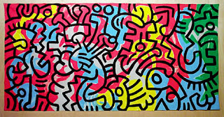
While his drawings may be very simplistic, Keith Haring’s artistic style is truly vibrant. Inspiration for his paintings came from graffiti, and Haring helped to move this artistic style mainstream. Most of his works involve drawings of people in which the viewer also sees the motion of the character(s). Using swift, black marks on the outlining figures, Haring creates the illusion that the character is participating in some sort of action. The backgrounds often stick to one predominant color while the characters also maintain their own individual color. The characters are faceless, and each separated from the environment by a distinct black outline. Haring is often known for his active characters in his art, but he also drew numerous abstract pieces. One of these (on bottom of the post) shows a wide range of colors and figures, which are not solidly one color like most of his works.
Haring’s works produce an active and positive atmosphere. The use of bright colors gives off upbeat and blissful feelings. The combination of these colors and the character’s actions forms strong messages of life. Haring was openly gay and often depicted this in his paintings. However, Haring’s paintings focus on concepts from war to AIDS (from which he died in 1990).
Monday, January 17, 2011
Subscribe to:
Posts (Atom)


